
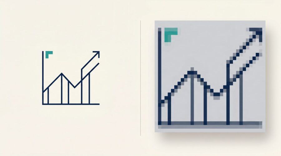
If you have an image with text that prints blurry, it’s almost always because the image is the wrong file format. JPG and PNG images are based on a fixed grid of pixels, and enlarging or reducing them turns their edges jagged or soft. The fix is to use a vector image for anything with text, and never to resize a raster file after it is made.
Vector vs Raster: What’s the Difference?
Every image on your computer is one of two kinds: a vector or a raster. Knowing which is which is key to sharp text in print, so it is worth two minutes to make the difference clear.
Think back to the graph paper from school maths: a grid of faint blue squares. Take a pen and ruler and draw a straight diagonal line across it. The line is smooth, and it crosses many squares without filling any of them completely. A vector image is like that pen-and-ruler line: the computer stores it as a piece of maths (start here, end there, this thick), so it can redraw the line perfectly at any size you ask for.
A raster image works the opposite way. It can only colour in whole squares: each square is either filled or empty, with nothing in between. To “draw” that same diagonal line, it fills every square the line passes through, which gives you a staircase of blocks instead of a clean edge. Make the squares small enough (high resolution) and your eye reads the staircase as a smooth line. Make them big, or blow the image up, and the staircase shows.
In practice, software softens that staircase by shading the edge squares in shades of grey to fake a smoother line. At low resolution, that is exactly what makes text look soft and fuzzy rather than cleanly jagged. Either way, the lesson is the same: a raster image only has the detail it was saved with, and a vector image can be redrawn as sharply as you like.
Photographs Are Raster: Just Mind the Resolution
A photograph is a raster image by its very nature, and that is completely fine. A camera captures a scene as a grid of coloured pixels; there is no equation describing it, just millions of tiny squares. The file formats you will meet most often for photos are JPG and PNG.
Because a photo has no text to keep crisp, you do not need to think about vectors at all. You only need enough pixels. The rule is 300 pixels per inch (ppi) at the size the photo is printed. Amazon KDP asks for the same 300 DPI minimum in its guide to formatting images, and a photo that clears that bar will reproduce cleanly on the page.
The catch is that the count is measured at the printed size, not on screen. A picture that looks huge on your monitor may only be 72 ppi, which is fine for a screen and far too little for print. Our note on interior image DPI for print-on-demand books walks through how to check that number before you place a photo.
Anything With Text Should Start as a Vector
For anything that carries text (charts, graphs, diagrams, maps, infographics, logos) start from a vector image instead of a raster one. This is the single most useful habit in this whole article.
The reason goes back to the graph paper. Because a vector is stored as maths rather than fixed pixels, it can be scaled up or down and stays perfectly sharp, so it survives being resized when your book is laid out. A raster version of the same chart is frozen at one resolution; enlarge it to fit the page and the labels soften. The vector formats you are most likely to see are SVG, EPS, AI (Adobe Illustrator), and PDF.
This is why a designer’s first question about a fuzzy logo is almost always “do you have the vector version?” A logo sent as a small JPG can only be rebuilt or replaced; the same logo as a vector file simply drops in and works at any size on the page.
The good news is that most authors already have vector sources without realising it. A chart built in Excel, a diagram drawn in Word or PowerPoint, and a logo from a professional designer all begin life as vectors. The trick is simply getting them out of those programs without turning them into pixels, which is exactly what the next two sections cover.
How to Get a Clean Vector From a Word or Excel Chart
If you are building a chart or diagram in an everyday program like Excel, Word, or PowerPoint, the simplest way to get a clean vector out is to export the file as a PDF from that program. On both Windows and Mac, use File > Export > Create PDF/XPS, or Save As and choose PDF.
Do this rather than “Print to PDF”, which can flatten everything to pixels on the way out. When you export properly, the text and lines in the chart travel as vectors, ready to be placed at any size without softening.
One honest caveat: not every PDF is a vector. Very complex charts (combination charts, scatter-plot markers, or inserted SVG graphics) can still be rasterised during export, and the result can differ between Windows and Mac. There is an easy way to check. Open the finished PDF and zoom in hard on the text. If the letters and lines stay razor-sharp however far you zoom, you have a vector. If they dissolve into blurry pixels, the chart was rasterised, and you will want to rebuild it or try the export again.
What If Your Graphic Is Made in Photoshop or Paint?
Some images are made in pixel-based editors like Adobe Photoshop, GIMP, or Microsoft Paint. These are raster tools, so any text you type in them becomes pixels the moment the file is saved. You still have two good ways to keep that text sharp in print.
The first option is to build the image at its final print size and resolution from the very start, so it never has to be scaled up later. Scaling is what does the damage; if the image is already the right size at 300 ppi, there is nothing to enlarge. For an ebook the principle is identical, except you size the image to the pixels it will display on screen rather than to a print resolution. The second option is to leave the text out of the image altogether and add it as live text on top during layout, where it stays vector-crisp. Keeping the wording as real text has a bonus: it is easy to edit later.
Between the two, option (b) is usually the safer bet for labels and captions. Let the picture be a picture, and let the words be words. However, this layering of text over the image works only for print: ebooks need a different approach, so if you don’t want to get too technical, go with option (a), which works in both print and digital.
What If a Raster File Is All You Have?
Sometimes the original is long gone and a raster file with the text baked in is all you have. You can improve it, but only so far, so it helps to know the limits.
Enlarging tools can soften the jaggedness a little. AI upscalers, and Photoshop’s own resampling options (Preserve Details 2.0, or Bicubic Smoother for making an image larger), try to smooth edges or invent the missing detail. Some let you lean towards a sharper or a smoother result depending on the image. But every one of them is a partial fix rather than a rescue, and with letters and numbers they can even reshape or invent characters. If you can find or rebuild a vector, always prefer that. As a rough guide, if you have to enlarge a raster image by more than a little to make it fit the page, treat the result as a stopgap and keep hunting for the original source file.
There is one more small win when you are stuck. If your only choice is between saving a text-bearing image as JPG or PNG, choose PNG. PNG uses lossless compression, so it better preserves the edges of text and lines. JPG throws away data to shrink the file, and it leaves fuzzy halos and blocky patches around precisely the high-contrast edges that letters are made of.
The habit behind all of this is simple: match the image type to the job. Photographs are raster, so give them enough pixels, which means 300 ppi at the size they print. Anything with text should be a vector, so it stays sharp at any size. And whichever you are using, avoid scaling a finished raster image up after the fact, because that is the exact moment sharp turns to soft.
Frequently Asked Questions
Is blurry text in my images a colour problem (RGB vs CMYK)?
No. Blurry text is a resolution and file-type problem, not a colour one. Colour mode (RGB or CMYK) affects how colours reproduce, not how sharp the edges of letters are. KDP accepts RGB images, so converting to CMYK will not rescue a soft chart or logo.
Should I use PNG or JPG for a chart, diagram, or logo?
Use PNG. It is lossless, so it keeps text and line edges relatively crisp. JPG’s compression adds fuzzy halos and blocky artefacts around sharp edges, which is the worst thing you can do to letters. Better still, use a true vector file (PDF, SVG, EPS, or AI) if you have one.
How can I tell if my PDF is actually a vector?
Open it and zoom in as far as you can on some text. A vector PDF stays razor-sharp at any zoom, because it is redrawn from maths. A raster PDF breaks up into visible, blurry pixels as you zoom. If it pixelates, it will print soft too.
Can I fix a low-resolution image just by enlarging it?
Only partially. Enlarging cannot add detail that was never captured; it can guess at it or smooth it, which softens the blur but does not remove it. For text especially, upscaling can distort the letters. Going back to a vector source, or rebuilding the image, is the only real fix.
What resolution do photographs need for print?
Aim for 300 pixels per inch (ppi) at the final printed size, which is the same figure most print-on-demand platforms ask for. Remember that it is measured at print size: an image can look large on screen yet still be too low-resolution once it is placed on the page.
If the printer turns everything into dots anyway, why do vectors matter?
It is true that a printer prints everything as tiny dots, vector art included. The difference is that the printer creates those dots from the vector’s exact mathematical description, at the last moment, at whatever resolution its own hardware is built for. So the text comes out as sharp as that particular printer can manage. A raster image, by contrast, arrives already made of a fixed grid of pixels; if that grid is coarse, the printer has nothing better to work from, and it cannot add back detail that was never there.
