
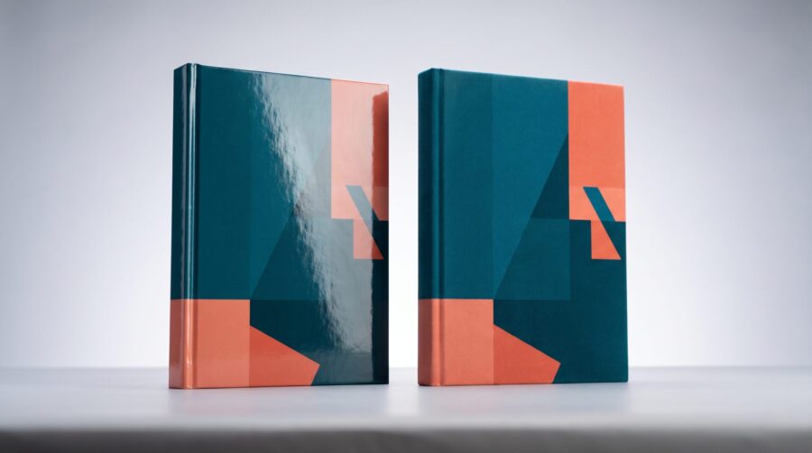
The choice between a matte vs glossy book cover comes down to look and feel, not durability. A glossy finish is shiny and makes colours look brighter and bolder. A matte finish is smooth with almost no shine and reads as calmer and more upmarket. Both protect your book equally well, so pick the one that fits your cover art and your readers.
What’s the Difference Between a Matte vs Glossy Book Cover?
The difference is the thin protective layer, called lamination, that print-on-demand companies apply over your printed cover. A glossy finish reflects light, so colours look vivid and the surface feels slick. A matte finish scatters light, so the cover looks soft and even, with a velvety feel and almost no glare. The lamination itself is the same kind of protection in both cases; only the surface look and feel change.
Lamination is not just decoration. It seals the printed cover against moisture, fingerprints, and everyday scuffing, which is why almost every paperback you pick up has either a matte or glossy coating rather than bare printed paper. That protective job is shared by both finishes. The decision is purely about the surface you want readers to see and touch.
Here is how the two finishes compare on the things authors actually notice:
| Attribute | Glossy finish | Matte finish |
|---|---|---|
| Surface look | Shiny, reflective | Soft, low-sheen |
| Colour appearance | Brighter, higher contrast | Slightly muted, gentler |
| Glare under light | Noticeable | Minimal |
| Fingerprints | Show, but wipe off easily | Hide most marks; grease can show |
| Feel in the hand | Slick | Tactile, “premium” |
| Common use | Children’s & photo books, textbooks, bold commercial covers | Novels, literary fiction, memoir, dark covers |
What Cover Finishes Do KDP and IngramSpark Offer?
Both major print-on-demand companies let you choose matte or glossy for a paperback, and the choice costs nothing extra. On Amazon, the KDP Print Options page lists glossy and matte as the two paperback cover finishes, printed on 80 lb (220 GSM) white cover stock. KDP describes glossy as shiny and matte as having minimal sheen and a subtle, polished look. The finish is a setting you pick during paperback setup, not a separate paid upgrade.
IngramSpark offers the same two paperback finishes and a few extra hardcover options. According to the IngramSpark user guide, hardcovers can be ordered with gloss laminate, matte laminate, or a Digital Cloth cover, which mimics a linen-textured cloth binding and can be produced with or without a dust jacket. This is the main practical difference between the two companies on finish: IngramSpark gives hardcovers a cloth-look option that KDP does not.
For hardcovers on either company, the finish sits on a “case laminate” cover, which means the printed artwork is laminated directly onto the rigid board rather than wrapped in a separate paper jacket. If you are weighing up a hardcover edition, our guide to what changes between a paperback and hardcover cover walks through the file differences in detail. Whichever route you take, the matte-or-glossy decision works the same way as it does for paperbacks.
Does the Finish Change How Your Cover Colours Look?
Yes, and this is the single biggest reason to think carefully before choosing. Glossy lamination makes colours look deeper and more saturated, and it boosts the contrast between light and dark areas. Matte lamination softens the same artwork, pulling brightness down a notch and reducing contrast. The printed ink is identical; the coating is what changes how your eye reads the colour.
That matters most for two kinds of cover. A cover built around bright, punchy colours, a glowing title, or a dramatic gradient will look its best in glossy, where the vibrancy survives. A cover that relies on a bold neon or a high-contrast photograph can look noticeably flat in matte. Something we see often: a cover that looks electric on a backlit screen loses some of its punch once matte lamination goes over it, which surprises authors who only ever judged the design on a monitor.
There is also a glare trade-off. A glossy cover reflects overhead lights and sunlight, which can make the cover hard to read at certain angles, while matte stays readable in almost any lighting. If your cover has a lot of fine text or a busy background, matte keeps it legible. Keep in mind that finish is separate from how colours are built in your file; for that, see our explainer on RGB versus CMYK for book covers.
Which Finish Shows Fingerprints and Scuffs More?
Glossy shows fingerprints more readily, but they wipe off; matte hides most handling marks, but deep scuffs and greasy smudges can show. Neither finish is fragile, and the lamination on both protects against moisture and everyday wear. The difference is only in how marks appear on the surface, not in how long the book lasts. Cover durability is a separate question from finish, which we cover in our piece on how long a print-on-demand paperback lasts.
The finish interacts strongly with how dark your cover is. On a near-black thriller or horror cover, a glossy coating shows every fingerprint, and hairline scuffs catch the light along the edges and spine. The same dark cover in matte hides those marks far better. There is a genuine trade-off, though: glossy lamination also makes black covers look darker and richer, so on a dark cover the real choice is between deeper colour (glossy) and a surface that stays cleaner-looking over time (matte). Many authors land on matte for dark, heavily inked covers because it holds up better in a reader’s hands and on a shop shelf.
Light-coloured covers are more forgiving either way. A white or pastel cover shows fewer fingerprints in glossy and fewer scuffs in matte, so the handling difference is smaller. One small production note worth knowing: when matte lamination goes over very heavy, dark ink coverage, tiny adhesion marks can sometimes appear along the folds. It is rarely a dealbreaker, but it is another reason to check a physical proof before committing to a large order.
Which Finish Suits Your Genre?
There is no rule, but readers do carry expectations, and matching them helps your book look like it belongs on the shelf. Glossy has long been the default for children’s picture books, photography and art books, cookbooks, and bold commercial covers where colour needs to pop; KDP itself lists glossy as typical for textbooks, children’s books, and nonfiction. Matte has become the popular modern choice for novels, literary fiction, memoir, and poetry, where a softer, understated surface signals a more upmarket feel, and KDP describes matte as typical for novels and other fiction. Text-led adult nonfiction, such as business and self-help, sits in the middle, with many authors now choosing matte for a calmer look.
If you write in a genre with strong visual conventions, it pays to look at what the bestsellers in your category are doing. A romance or thriller list dominated by glossy covers sets a reader expectation, and an unusual finish can make a book feel slightly off without the reader knowing why. The reverse is true in literary fiction, where matte now reads as the norm. Browsing the print editions in your genre, rather than guessing, is the fastest way to see which way the convention leans.
That said, conventions are guidance, not law. Plenty of successful books break the pattern on purpose to stand out. The safest approach is to start from your genre’s norm, then deviate only if you have a clear reason, such as a foil or spot-gloss design element that needs a matte background to show up. When in doubt, the understated matte finish rarely looks wrong, which is part of why it has become so widely used.
How to Decide Before You Publish
The best way to choose is to hold both finishes in your hands rather than judging from a screen. A screen cannot show you sheen, glare, or feel, and the on-screen previewer in your publishing dashboard does not display the finish either. The only reliable test is a physical proof or author copy. Order one printed copy in each finish, look at them in normal indoor light and near a window, and the right choice usually becomes obvious within seconds.
The good news is that finish is one of the few print settings you can change after your book is live. Because the finish lives in your paperback setup rather than in the cover artwork itself, switching from glossy to matte (or back) does not require redesigning the file. If you launch with one finish and decide the other suits the book better, you can update the setting and order fresh copies. That makes the decision lower-stakes than it first appears, but a proof in hand still saves you from second-guessing.
Choosing between a matte and glossy cover is one of the lower-risk decisions in self-publishing: both protect your book equally, the price is the same, and you can change your mind after launch. Start from what suits your artwork and your genre, lean matte for dark or text-heavy covers and glossy for bright, colour-driven ones, and confirm the choice with a printed proof in each finish before you order in quantity.
Frequently Asked Questions
Is matte or glossy more popular for self-published books?
Matte has become the more common modern choice for novels, literary fiction, and memoir, where its soft, low-sheen surface reads as upmarket. Glossy remains standard for children’s books, photography and illustrated books, and bold commercial covers where vivid colour matters most. Neither is better; popularity follows genre.
Does choosing matte or glossy cost extra?
No. On both KDP and IngramSpark, matte and glossy are offered at the same price for a paperback, and the finish does not change your printing cost or royalty. You simply pick one during cover setup.
Do ebook covers have a matte or glossy finish?
No. An ebook cover is a digital image shown on a screen, so it has no physical lamination; the matte-versus-glossy choice only applies to printed paperbacks and hardcovers. A digital edition is instead about your ebook cover dimensions and file specs.
What finish do hardcover books use?
Hardcovers use a case laminate cover, where the printed artwork is laminated straight onto the board. You still choose matte or glossy. IngramSpark also offers a Digital Cloth option that imitates a linen-textured cloth binding, with or without a dust jacket.
Will a glossy cover cause glare when reading?
It can. Glossy lamination reflects overhead lights and sunlight, which may make the cover harder to read at some angles. Matte scatters light and stays readable in almost any lighting, which is one reason text-heavy or busy covers often work better in matte.
