
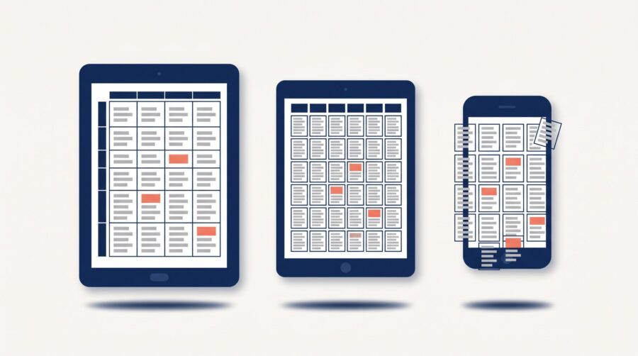
Tables in ebooks break because an ebook reflows its text to fit any screen, while a table is a fixed grid that may not stretch or shrink as elegantly. On a narrow phone, columns wrap, numbers stack, and a wide table may spill off the edge. The reliable fix is to build a simple table in HTML, keep it small, and test it on a real device before you publish.
Why do tables break when you convert a book to an ebook?
Tables break because most ebooks are “reflowable,” which means the text rearranges itself to fit whatever screen it lands on. A paragraph can do this easily because words simply wrap to the next line. A table cannot, because it is a fixed grid of rows and columns that all have to line up. When the screen gets narrower than the table was designed for, the reader has to make a choice no one likes: squeeze the columns until the words wrap into a tangle, or let the table run off the edge of the page.
This is the core difference between a reflowable ebook and a fixed-layout EPUB, where everything stays locked in place like a PDF. Novels and most non-fiction are reflowable so readers can change the font size; that flexibility is exactly what a rigid table fights against.
A second cause is the conversion itself. Many tables that arrive in a Word file were never built as real tables. They were lined up with the tab key, with extra spaces, or with text boxes, and they only look like a grid on the author’s screen. The most common version of this in the manuscripts we convert is a “table” made of tab stops; it survives in Word and then collapses into a single run of jumbled text the moment it becomes an EPUB. Tables built with merged cells or a table-inside-a-table also tend to come apart, because the ebook format has no dependable way to redraw that structure on a small screen.
How should you format a table for an ebook?
Build the table as a real HTML table and keep it as simple as you can. Amazon’s KDP table guidelines for reflowable books tell authors to use standard <table> markup with plain rows and columns, and to size columns with percentages rather than fixed pixel widths so the table can adapt to different screens. A column set to “30%” can flex; a column set to “300 pixels” cannot, and that is often what forces the overflow.
KDP also publishes hard limits worth knowing before you design anything ambitious. Kindle’s Enhanced Typesetting does not support a table with more than 1,800 cells and 20,000 characters, and Amazon recommends keeping tables under 100 rows and 10 columns. That column ceiling is generous, though. In practice, aim for no more than about four columns: the column headings are usually words, and words wrap and break long before the numbers in the cells do, so even an all-numeric table becomes hard to read past four or five columns. Enhanced Typesetting is also unsupported for nested tables (a table placed inside a cell) and negative margins, and Amazon advises against putting whole paragraphs of text or large pictures inside a single cell.
A few habits prevent most problems:
- Use percentage widths, not fixed pixel widths, so columns can shrink proportionally on small screens.
- Mark header cells with real header tags rather than just bolding them, so every device and screen reader knows which row is the heading.
- Avoid merged cells, nested tables, and empty “spacer” columns added just for padding.
- Keep each cell to a few words or a number, not a paragraph.
- Reduce the table’s text to roughly 85% of your body-text size, set as a relative size (a percentage) rather than a fixed point size, so it still scales when the reader changes the font.
- Break up or redesign any table with more than about four columns; a wide grid rarely survives a phone screen intact.
Here is a simple three-column table built with those habits in mind, followed by the markup that produces it:
| Plan | Monthly Price | Users |
|---|---|---|
| Starter | $9 | 1 |
| Standard | $19 | 5 |
| Team | $39 | 20 |
| Business | $79 | 50 |
<table style="width:100%; font-size:85%; border-collapse:collapse;">
  <thead>
    <tr>
      <th style="width:40%; border:1px solid #999;">Plan</th>
      <th style="width:30%; border:1px solid #999;">Monthly Price</th>
      <th style="width:30%; border:1px solid #999;">Users</th>
    </tr>
  </thead>
  <tbody>
    <tr>
      <td style="border:1px solid #999;">Starter</td>
      <td style="border:1px solid #999;">$9</td>
      <td style="border:1px solid #999;">1</td>
    </tr>
    <!-- ...further rows follow the same pattern... -->
  </tbody>
</table>
The width sits on the table, the percentage widths sit on the header cells (<th>), and the reduced font size is set on the table as a percentage so it scales with the reader. One styling choice is worth calling out: in print, good typesetting keeps rules to a minimum, usually one line above the column headings, one below them, and one at the foot of the table. On a small screen, where columns sit close together and text can wrap inside a cell, it helps to do the opposite and give every cell all four borders, so the reader can always see where one cell ends and the next begins.
When we rebuild an author’s table during conversion, the version that holds together is almost always the narrow one: three or four columns, plain text, and headings short enough that they do not wrap. The tables that need rebuilding from scratch are the wide ones, where a merged title row spans eight columns and the headings themselves break onto two or three lines before the reader has even reached the data.
Should you turn a table into an image?
Turning a table into an image will lock its appearance, but it costs you more than most authors expect, so treat it as a last resort rather than a first move. When a table is a picture, the ereader cannot break it across pages, cannot resize it with the reader’s chosen font, and cannot read it aloud. A screen reader or a refreshable braille display sees nothing but the alternative text you attach, so a data table delivered as an image is effectively invisible to readers who rely on assistive technology.
This is why KDP specifically recommends real <table> markup over images: with an HTML table, pagination works and the content stays available to screen readers. The accessibility argument is not a niche concern either; the DAISY Consortium’s guidance on accessible tables treats proper table markup as the baseline for making tabular data usable to everyone. An image of a table also runs into the same trouble that images already face in EPUB conversion: it can look sharp on one device and fuzzy on another, and a wide image shrinks until the numbers are unreadable on a phone.
If you do use an image (for a genuinely complex table that cannot be simplified), make it tall rather than wide so it stays legible on a narrow screen, and always write descriptive alt text that conveys the actual data, not just “table.” By tall, we mean a genuinely portrait image, not a wide table turned on its side. Rotating a table to landscape rarely helps, because many ereaders rotate the whole page when the reader turns their device, so a sideways table ends up permanently 90 degrees out of true no matter how the reader holds things.
How do tables look on Kindle, Apple Books, and Kobo?
The same EPUB can render a table differently depending on the store, which is why a file that looks perfect in one app can disappoint in another. Each retailer runs its own display engine, so a table is one of the clearest places you will see an EPUB pass on Kindle but stumble elsewhere. Here is how the three biggest platforms handle tables:
| Platform | How it handles tables | Practical takeaway |
|---|---|---|
| Amazon Kindle | Renders HTML tables with Enhanced Typesetting; a table with more than three columns can be opened in an interactive table viewer by double-tapping, but unsupported tables lose that feature. | Stay within the 1,800-cell / 20,000-character limits and keep markup simple. |
| Apple Books | In reflowable books, sizes large tables to fit the page width; a reader can double-tap a table to open it in a pop-up web view and pan or zoom. | Wide tables survive better here, but do not rely on the pop-up as a substitute for a clean table. |
| Kobo | Uses its own conversion engine; guidance is to keep tables simple and ensure they fit in portrait orientation before conversion. | Test in portrait mode; landscape-width tables tend to overflow. |
Apple’s own Apple Books Asset Guide documents the resize-to-fit and double-tap pop-up behaviour, while Kobo’s Word document conversion guidelines tell authors to confirm a table fits in portrait before uploading. The lesson we draw from sending the same file to every store is simple: a table that is comfortably narrow passes everywhere, while a table built right up to the limits of what Kindle allows is the one that breaks on the next platform.
How to handle a very large or wide table
If your data will not fit a simple, narrow grid, redesign it rather than forcing it. A wide spreadsheet of figures is built for a 13-inch laptop, not a 6-inch phone, and no conversion trick changes that. You have three good options, in order of preference.
- Split it into smaller tables. A 12-column table usually works better as three linked tables of about four columns each, with a short heading above each.
- Convert it into a list or short prose. Much tabular data is clearer as a list once it is freed from the grid. “Plan A: $9/month, 3 users, 10GB” reads cleanly on any screen, where the same row in a five-column table would wrap awkwardly.
- Use a fixed-layout edition only if you must. For data-heavy or highly visual books (cookbooks, technical manuals, workbooks), a fixed-layout EPUB keeps tables locked in place, at the cost of readers being unable to resize the text. This is the exception, not the rule.
Whichever route you take, preview the result on more than one device before you publish. A table that looks fine in your formatting software can still wrap badly in the wild, and the only way to know is to check the ebook on a phone, a tablet, and an ereader. The narrow phone screen is the real test; if the table reads there, it will read everywhere.
Tables are one of the few places where the flexibility that makes ebooks great works against you. The grid wants to stay fixed; the ebook wants to reflow. Build simple HTML tables, respect each platform’s limits, and when the data is too big for a small screen, split it or turn it into a list. A few minutes previewing on a phone before you publish will catch nearly every table problem before a reader ever sees it.
Frequently Asked Questions
Why does my table look fine on my computer but break on a phone?
Your computer screen is wide enough to show the whole grid, so the columns never have to compress. A phone is far narrower, and because a reflowable ebook resizes its content to fit, the columns are forced to wrap or the table overflows. Always check tables on a phone-sized screen, not just your laptop.
Can I just insert my table as a picture?
You can, but it has real drawbacks: an image of a table cannot be read aloud by screen readers, cannot break across pages, and often turns fuzzy or too small on a phone. KDP recommends real HTML tables instead. Reserve images for genuinely complex tables you cannot simplify, and always add descriptive alt text.
Do tables work the same on Kindle, Apple Books, and Kobo?
No. Each store uses its own display engine. Kindle renders HTML tables and can open wider ones in a table viewer, Apple Books resizes tables to fit and offers a double-tap pop-up to zoom, and Kobo keeps things simplest and prefers tables that fit in portrait. A narrow, simple table is the only version that behaves consistently across all three.
What is the maximum table size for a Kindle ebook?
Amazon’s Enhanced Typesetting does not support tables larger than 1,800 cells and 20,000 characters, and recommends keeping tables under 100 rows and 10 columns. Nested tables and negative margins are also unsupported. In practice, aim for four columns or fewer, and if your data exceeds these limits, split it into smaller tables.
Should I turn a table into a list instead?
Often, yes. Much of what authors put in tables (plans, features, simple comparisons) reads more clearly as a short list on a small screen. Lists reflow naturally and never overflow, so if your table is really just a few paired facts, a list is usually the more reliable choice in an ebook.
